gbk to genome map
Last updated:
Note: This is a tutorial was made for the purposes of running on the Cooper Lab server. This may or may not work on your local computer depending on whether you have the correct dependencies installed. This is also still a working draft so please reach out if you get stuck or if anything is unclear.
Sources:
- Documentation for the gggenes package in R can be found here.
- The GitHub repository for gggenes can be found here.
Converting .gbk to .csv
We will be working with a Genbank file (.gbk) so make sure you have that ready with you. If you want the same test file that I will be working with, you can download the file for Pseudomonas aeruginosa PA14 at Pseudomonas.com and clicking “GBK” under Download Gene Annotations, or by clicking here (you’ll get a pop up asking you where you want to save the file).
Downloading gbk-to-csv converter
Once you have your gbk file, we will need to first convert it to csv. Technically, there are R packages that can read gbk files directly but they tend to be slow (and last time I tried it, it crashed my RStudio) so we’re going to bypass this method by doing this on beagle and running my custom python script that converts gbk to csv (extract_gbk_to_csv.py).
If you don’t have it, you can download it through my Google Drive link here.
Upload extract_gbk_to_csv.py, to your desired location in beagle. The filepath below reflects where I have the python script saved on my computer so this filepath will be different for everyone:
scp -r /Users/kubotan/Documents/PMI/Cooper\ Lab/CS\ tutorial/script/extract_gbk_to_csv.py nak177@beagle.mmg.pitt.edu://home/nak177/scripts
I’ve saved the python script onto beagle in my home directory under the scripts folder.
Once that is uploaded, you’ll also want to upload your gbk file onto beagle if you haven’t already.
IMPORTANT: Your gbk file should only contain one chromosome or one plasmid. Some sequence files may contain multiple chromosomes and plasmids, in which case you will need to isolate into one in your gbk file.
Run python script
Make sure you load miniconda3 before running the script:
module load miniconda/miniconda-3
Now you can run the gbk-to-csv converter by doing:
python3 /home/nak177/scripts/extract_gbk_to_csv.py -i /home/nak177/ref_seq/Pseudomonas_aeruginosa_UCBPP-PA14_109.gbk -o /home/nak177/ref_seq/PA14_gbk_to_csv
There are three file paths listed in the above line of code:
- Your python script location
- -i followed by your filepath to your gbk file
- -o followed by your output filepath with the prefix PA14_gbk_to_csv
This will create a csv file named “PA14_gbk_to_csv.csv” within my ref_seq folder in my home directory on beagle.
The arguments for the gbk-to-csv converter are as follows:
- -i (or –input): filepath to your gbk file (required)
- -o (or –output): filepath + filename of your csv file. If output is not assigned, then it defaults to “gbk_to_csv.csv” which will be saved to your current directory.
Plotting in R with gggenes
Once you have your csv file, download it to your local computer and read it in R.
gm <- read.csv("/Users/kubotan/Documents/PMI/Cooper Lab/CS tutorial/data/PA14_gbk_to_csv.csv", row.names = 1)
If you use the head( ) function then the first few rows of your table should look something like this:
head(gm)
##    locus_tag gene                                    product start  end strand
## 0 PA14_00010 dnaA chromosomal replication initiation protein   482 2027      1
## 1 PA14_00020 dnaN            DNA polymerase III subunit beta  2055 3159      1
## 2 PA14_00030 recF                    recombination protein F  3168 4278      1
## 3 PA14_00050 gyrB                       DNA gyrase subunit B  4274 6695      1
## 4 PA14_00060 None                            acyltransferase  7017 7791     -1
## 5 PA14_00070 None   D,D-heptose 1,7-bisphosphate phosphatase  7802 8339     -1
- locus_tag: locus tag id for each unique gene
- gene: gene name
- product: name of product made from gene
- start: start position of gene
- end: end position of gene
- strand: denotes whether gene is on base (1) or complementary (-1) strand
The strand column indicates whether the gene is on the base strand or the complementary strand. If it is in the base strand, then a value of 1 (i.e. TRUE) is assigned. If it is on the complementary strand, then a value of -1 (i.e. FALSE) is assigned. Although the gggenes documentation says that -1 will be interpreted as the complement (i.e. FALSE), this is not the case so we will convert -1 into 0 (i.e. FALSE) so that R knows that -1 is the NOT on the base strand.
gm$strand[gm$strand==-1] <- 0
Subset dataframe
Lets say that I want to view the genome map of PA14 between locus PA14_48880 to PA14_49030 (this is a prophage region).
Since this is a big dataframe, it is best to subset it into a smaller dataframe that contains only the region that I am interested in.
First, find which row the locus is located in the dataframe:
which(gm$locus_tag=="PA14_48880") #find row number of first locus
## [1] 3941
which(gm$locus_tag=="PA14_49030") #find row number of second locus
## [1] 3956
Now that I know I will want to subset between rows 3941 and 3956, lets make the smaller dataframe:
phage <- gm[3941:3956,]
Map single genome in gggenes
We will need to following R packages to plot:
library(gggenes)
library(ggplot2)
library(RColorBrewer)
library(scales)
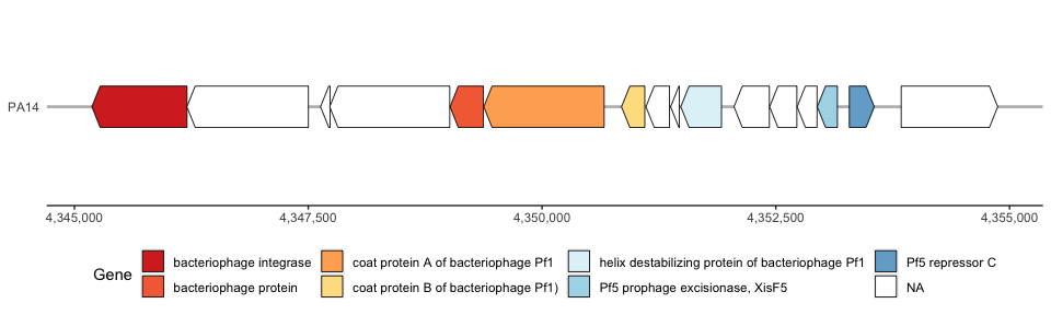
I will make a new column in my phage dataframe called “Genome”. This will label the genome track with my strain name (i.e. PA14) on the left hand side of the plot. This may become more important if you want to plot multiple gene tracks (multiple strains) next to each other. We will first just plot one genome to keep it simple.
phage$Genome <- "PA14" #make a new column indicating that this is PA14; this is what will later label our gene map track
Use RColorBrewer to get a color palette for our genome map. To do so, first count the number of colors we will need:
colorCount <- length(levels(as.factor(phage$product))) #count number of unique varibles in product column
getPalette = colorRampPalette(brewer.pal(colorCount, "RdYlBu")) #get color codes
Then finally use ggplot to plot the genome map:
phage_map <- ggplot()+
  geom_gene_arrow(data=phage, #dataframe
  aes(xmin = start, xmax = end, y = Genome,fill = product, forward = strand), #x axis, y axis, color, and arrow direction
  arrowhead_height = unit(1, "cm"),arrowhead_width = unit(2, "mm"),arrow_body_height = unit(1,"cm"))+ #gene arrow parameters
  scale_fill_manual(values = getPalette(colorCount), name="Gene")+ #gene color parameters
  theme_genes()+ #theme function unique to gggenes
  theme(axis.title.x = element_blank(), #remove x axis title
  axis.title.y = element_blank(), #remove y axis title
  legend.position = "bottom")+ #put color legend to bottom of figure
  scale_x_continuous(labels=comma) #use comma separation for base position numbers

phage_map #show plot
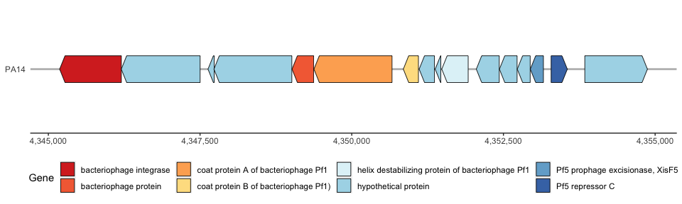
I personally don’t like it when the hypothetical proteins are colored, so I will change this by assigning NAs to hypothetical proteins and coloring them white:
phage$label <- phage$product #make a new column that is identical to the product column
for (i in 1:nrow(phage)) {
  if(phage$product[i]=="hypothetical protein"){
    phage$label[i] <- NA
  }
}
head(phage$label)
## [1] "bacteriophage integrase"             NA
## [3] NA                                    NA
## [5] "bacteriophage protein"               "coat protein A of bacteriophage Pf1"
Now plot in ggplot. Make sure to change fill = label in the geom_gene_arrow( ) function and add na.value = “white” to the scale_fill_manual( ) function:
phage_map2 <- ggplot()+
  geom_gene_arrow(data=phage, aes(xmin = start, xmax = end, y = Genome, fill = label, forward = strand),arrowhead_height = unit(1, "cm"),arrowhead_width = unit(2, "mm"),arrow_body_height = unit(1,"cm"))+ #change to fill = label
  scale_fill_manual(values = getPalette(colorCount), name="Gene", na.value = "white")+ #added na.value = "white"
  theme_genes()+
  theme(axis.title.x = element_blank(), axis.title.y = element_blank(), legend.position = "bottom")+
  scale_x_continuous(labels=comma)

phage_map2
Map multiple genomes on gggenes
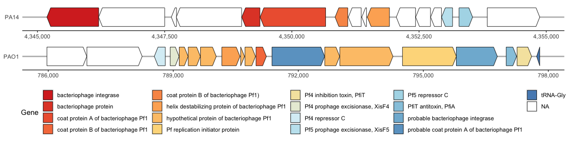
gggenes also has the option to plot multiple genomes on the same plot. To do this, we will plot the Pf5 prophage genome alongside with its relative, the Pf4 prophage in PAO1.
You can download the PAO1 genome from Pseudomonas.com.
After you have downloaded the file, do the same as the previous section and convert the GenBank file into a csv file.
pao1 <- read.csv("/Users/kubotan/Documents/PMI/Cooper Lab/CS tutorial/data/PAO1_gbk_to_csv.csv", row.names = 1)
head(pao1)
##   locus_tag gene                                        product start  end
## 0    PA0001 dnaA chromosomal replication initiator protein DnaA   482 2027
## 1    PA0002 dnaN                 DNA polymerase III, beta chain  2055 3159
## 2    PA0003 recF                                   RecF protein  3168 4278
## 3    PA0004 gyrB                           DNA gyrase subunit B  4274 6695
## 4    PA0005 lptA    lysophosphatidic acid acyltransferase, LptA  7017 7791
## 5    PA0006 None                 conserved hypothetical protein  7802 8339
##   strand
## 0      1
## 1      1
## 2      1
## 3      1
## 4     -1
## 5     -1
Make sure to remember and convert the reverse strand (-1) in the strand column to 0.
pao1$strand[pao1$strand==-1] <- 0
head(pao1)
##   locus_tag gene                                        product start  end
## 0    PA0001 dnaA chromosomal replication initiator protein DnaA   482 2027
## 1    PA0002 dnaN                 DNA polymerase III, beta chain  2055 3159
## 2    PA0003 recF                                   RecF protein  3168 4278
## 3    PA0004 gyrB                           DNA gyrase subunit B  4274 6695
## 4    PA0005 lptA    lysophosphatidic acid acyltransferase, LptA  7017 7791
## 5    PA0006 None                 conserved hypothetical protein  7802 8339
##   strand
## 0      1
## 1      1
## 2      1
## 3      1
## 4      0
## 5      0
The Pf4 prophage is located between the locus tags PA0715 and PA0729.1 so we will find the rows for both:
which(pao1$locus_tag=="PA0715") #find row number of first locus
## [1] 726
which(pao1$locus_tag=="PA0729.1") #find row number of second locus
## [1] 744
We will want to make a new dataframe that is a subset between rows 726 and 744:
phage2 <- pao1[726:744,]
Similar to what we did for Pf5, we will make a new column in my phage2 dataframe called “Genome”. This will label the genome track with my strain name (i.e. PAO1) on the left hand side of the plot. This is important if you want to plot multiple gene tracks (ex. PA14 vs PAO1) next to each other.
phage2$Genome <- "PAO1" #make a new column indicating that this is PAO1; this is what will later label our gene map track
Before we combine the Pf5 and Pf4 dataframe, we will clean up the Pf4 dataframe by changing the hypothetical protein in the “label” column with NAs similar to what we did to our Pf5 dataframe:
phage2$label <- phage2$product #make a new column that is identical to the product column
for (i in 1:nrow(phage2)) {
  if(phage2$product[i]=="hypothetical protein"){
    phage2$label[i] <- NA
  }
}
head(phage2$label)
## [1] NA
## [2] NA
## [3] "Pf4 repressor C"
## [4] "Pf4 prophage excisionase, XisF4"
## [5] "hypothetical protein of bacteriophage Pf1"
## [6] "hypothetical protein of bacteriophage Pf1"
Now lets combine our Pf5 dataframe with our Pf4 dataframe:
master <- rbind(phage, phage2)
Use RColorBrewer to get a color palette for our genome map. To do so, first count the number of colors we will need:
colorCount2 <- length(levels(as.factor(master$product))) #count number of unique varibles in product column
We can now plot our combined dataframe and compare the two Pf phage genomes side-by-side:
phage_map3 <- ggplot()+
  geom_gene_arrow(data=master, aes(xmin = start, xmax = end, y = Genome, fill = label, forward = strand),arrowhead_height = unit(1, "cm"),arrowhead_width = unit(2, "mm"),arrow_body_height = unit(1,"cm"))+ #change to fill = label
  facet_wrap(~ Genome, scales = "free", ncol = 1)+ #separate track by genome and allowing free scaling of x axis
  scale_fill_manual(values = getPalette(colorCount2), name="Gene", na.value = "white")+ #added na.value = "white"
  theme_genes()+
  theme(axis.title.x = element_blank(), axis.title.y = element_blank(), legend.position = "bottom")+
  scale_x_continuous(labels=comma)

phage_map3
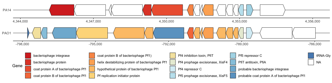
The Pf4 and Pf5 prophage within the PAO1 and PA14 genomes, respectively, are similar but this is hard to visualize since the prophages are in the reverse direction. Lets flip the Pf4 (PAO1) prophage so that it is facing the same orientation as Pf5 (PA14).
The best way to do this is to assign negative numbers to the start and end columns on ONLY the PAO1 rows:
master$start[which(master$Genome == "PAO1")] <- master$start[which(master$Genome == "PAO1")] * -1
master$end[which(master$Genome == "PAO1")] <- master$end[which(master$Genome == "PAO1")] * -1
If we run the same ggplot again, we can see that this has flipped the Pf4 (PAO1) genome as desired:
phage_map3 <- ggplot()+
  geom_gene_arrow(data=master, aes(xmin = start, xmax = end, y = Genome, fill = label, forward = strand),arrowhead_height = unit(1, "cm"),arrowhead_width = unit(2, "mm"),arrow_body_height = unit(1,"cm"))+ #change to fill = label
  facet_wrap(~ Genome, scales = "free", ncol = 1)+ #separate track by genome and allowing free scaling of x axis
  scale_fill_manual(values = getPalette(colorCount2), name="Gene", na.value = "white")+ #added na.value = "white"
  theme_genes()+
  theme(axis.title.x = element_blank(), axis.title.y = element_blank(), legend.position = "bottom")+
  scale_x_continuous(labels=comma)

phage_map3
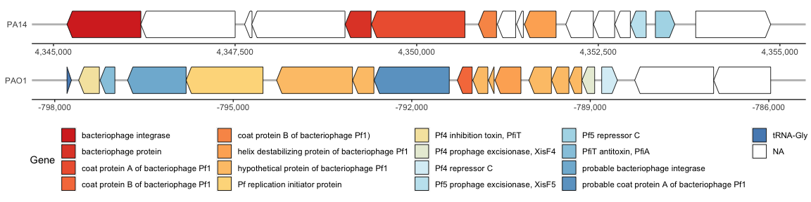
Both genomes have the “helix destabilizing protein of bacteriophage Pf1” so we will aligned both tracks around that gene. To do so, we will use the make_alignment_dummies( ) function. However, this function contained a bug that has been fixed on the GitHub repository, but may not be reflected in the R packages, so the fixed function can be found in my lab Google Drive folder here. Be sure to run this updated function before proceeding.
After running the updated function, run the following code:
dummies <- make_alignment_dummies( #use own make_alignment dummies b/c original function contains bugs
  master,
  aes(xmin = start, xmax = end, y = Genome, id = product),
  on = "helix destabilizing protein of bacteriophage Pf1" #the gene you want to align on
)
Now lets plot the prophage genomes:
phage_map4 <- ggplot()+
  geom_gene_arrow(data=master, aes(xmin = start, xmax = end, y = Genome, fill = label, forward = strand),arrowhead_height = unit(1, "cm"),arrowhead_width = unit(2, "mm"),arrow_body_height = unit(1,"cm"))+ #change to fill = label
  geom_blank(data=dummies, aes(xmin = start, xmax = end, y = Genome))+ #allows alignment around the shared gene
  facet_wrap(~ Genome, scales = "free", ncol = 1)+ #separate track by genome and allowing free scaling of x axis
  scale_fill_manual(values = getPalette(colorCount2), name="Gene", na.value = "white")+ #added na.value = "white"
  theme_genes()+
  theme(axis.title.x = element_blank(), axis.title.y = element_blank(), legend.position = "bottom")+
  scale_x_continuous(labels=comma)

phage_map4